Project Overview
The location, history and architectural intent of the project called for a strong and sustaining name. It needed to pay homage to the locale and neighbouring buildings while speaking to a future ecosystem; one that blurs the lines between work and play.
Each project name plays a pivotal role; directing personality and tone of voice, connecting the project with its intended audience. With this in mind, we ensured this name could speak plainly to connect people and place: The Masonry.
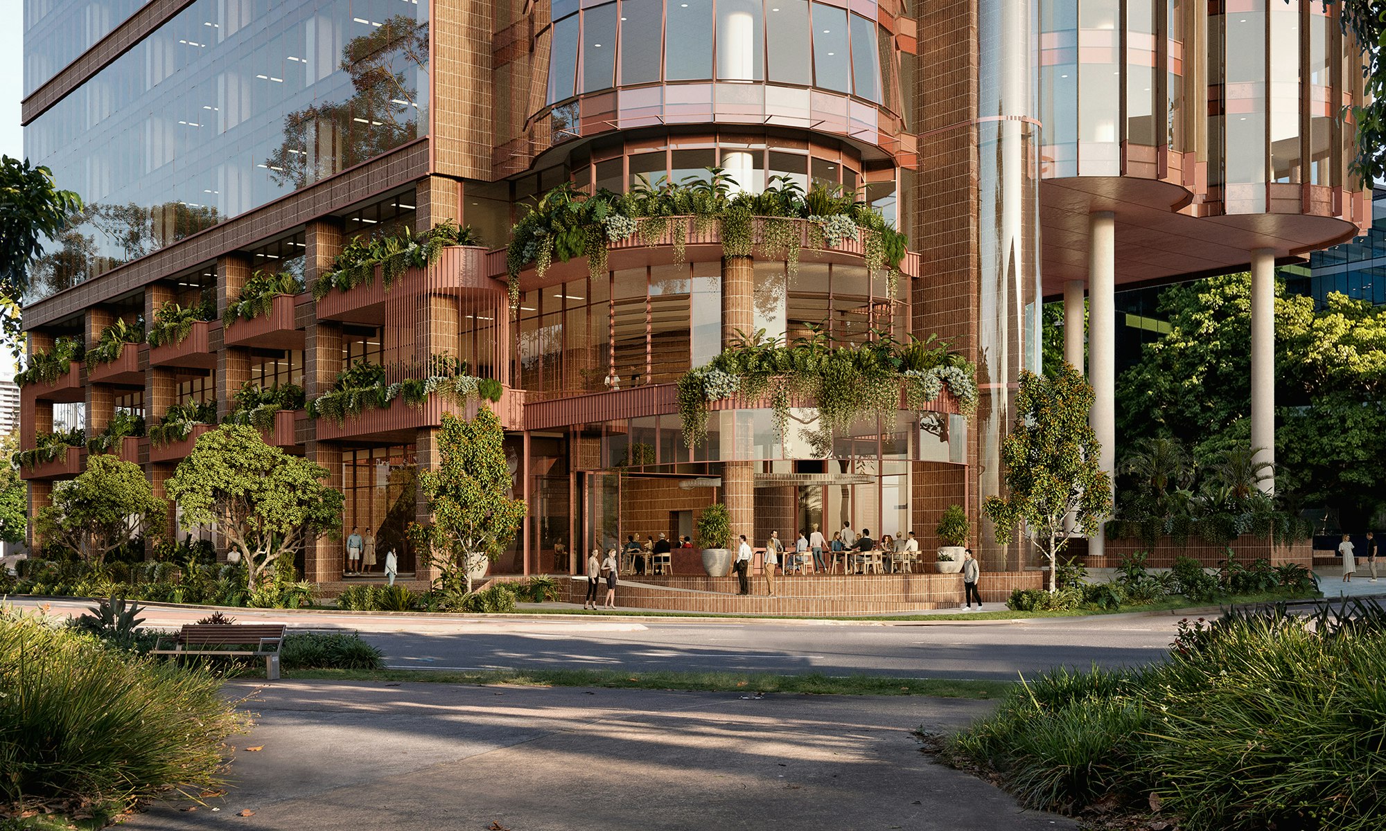
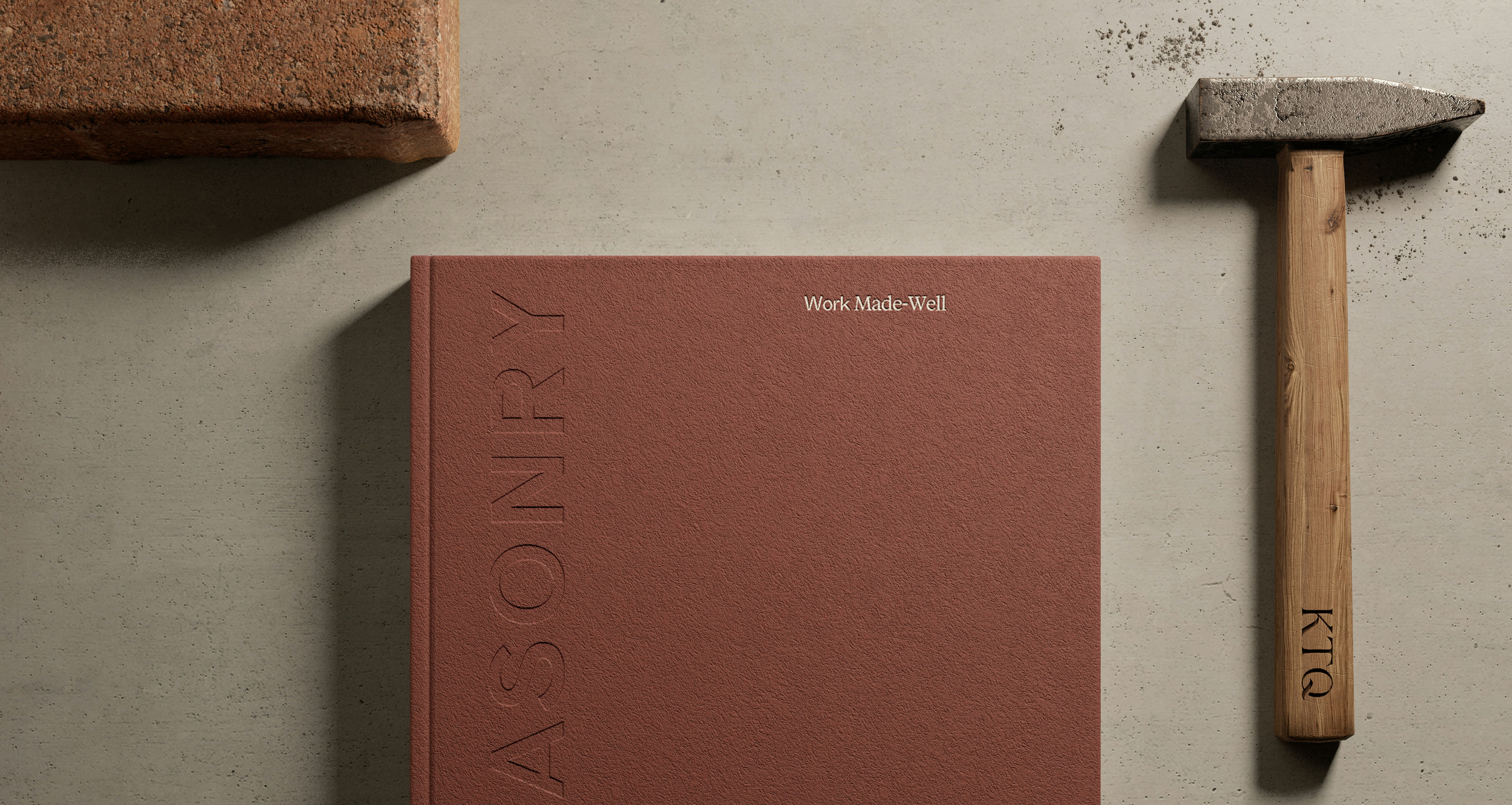
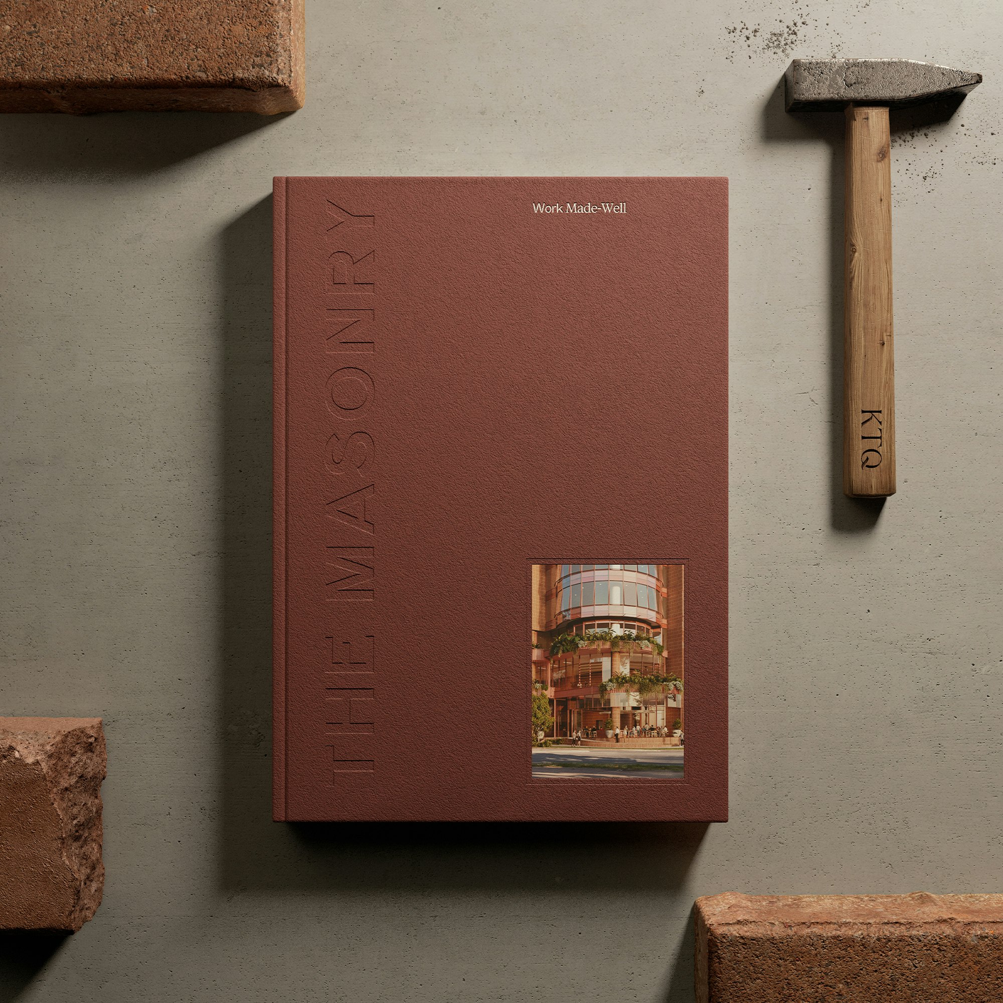
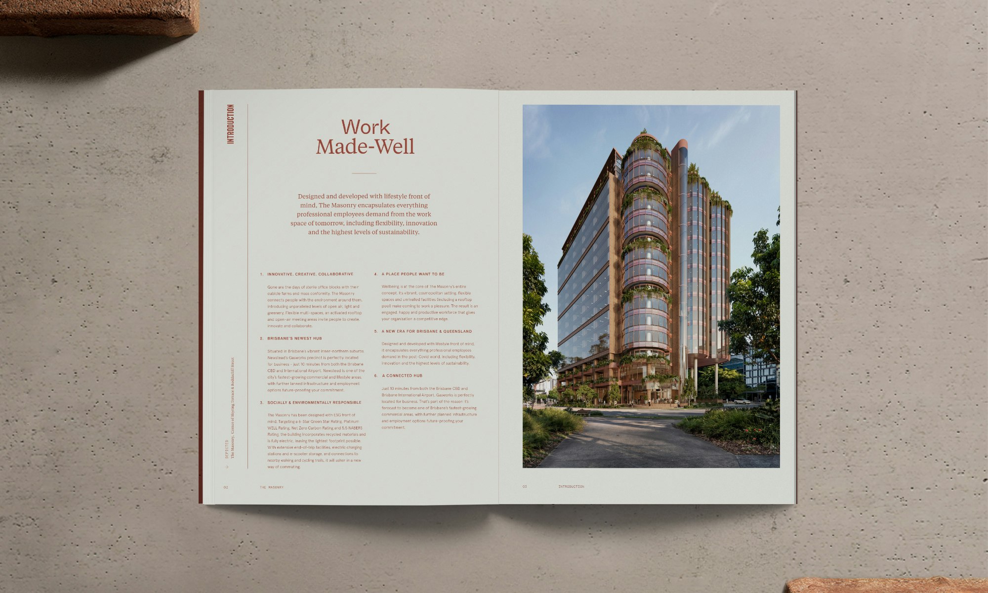
With KTQ’s backing and project name established, our trajectory for branding was set. The visual brand identity takes cues from The Masonry’s strong red-brick façade and the workshop-style architecture. To embody the essence of the project, we crafted a bold colour palette paired with hand-chiselled customised typefaces.
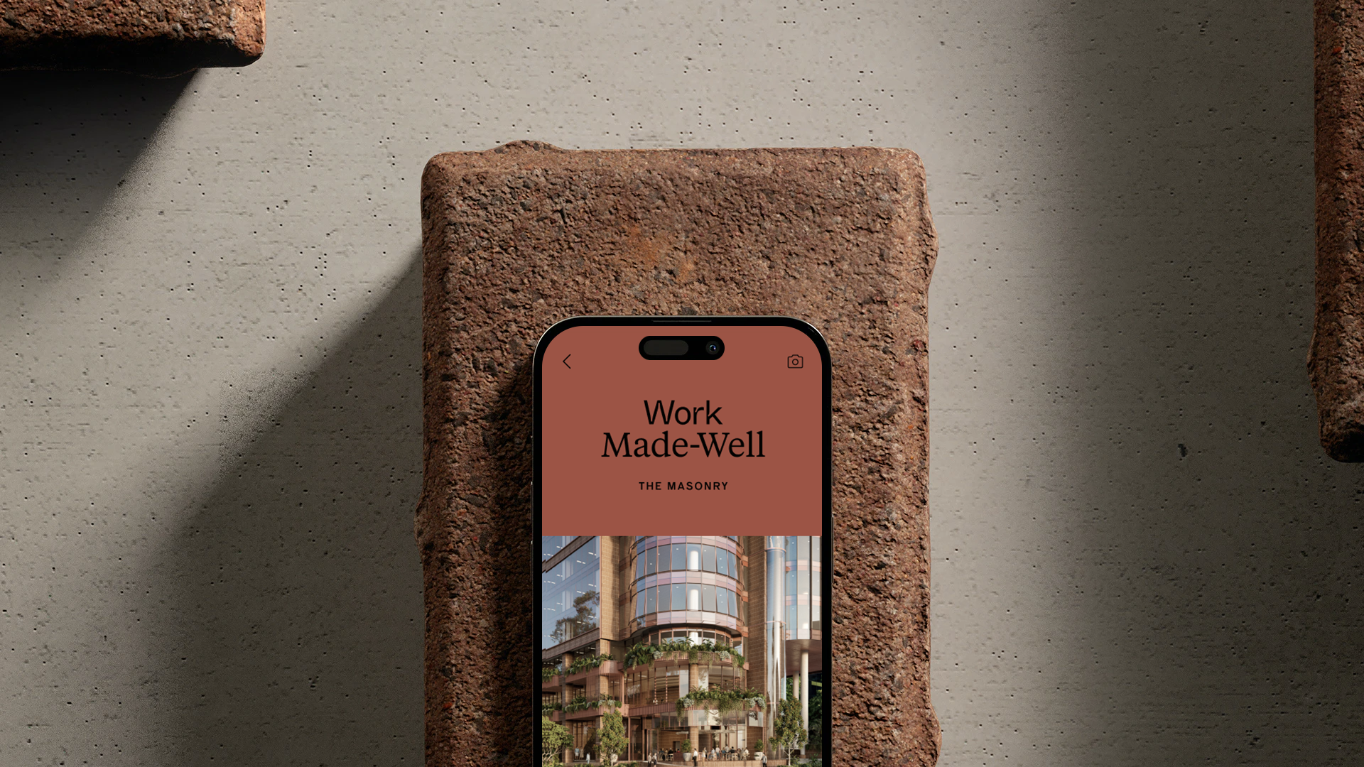
From here, we coined the phrase: Work Made-Well. This phrase needed to tie the strategic concept of The Masonry together. The word, ‘well’ is all-encompassing, not singular; a nod to the wellness focus. While the word ‘made’ is a call out to The Masonry’s makers and artisans.
Unlocking a compelling marketing approach for The Masonry was core to our work. We conducted independent research and collaborated closely with KTQ’s commercial sales and leasing team for insights that unearthed this competitive edge: Be human. Harness emotive creative. Go beyond facts and figures—focus on the end user and how they stand to benefit.
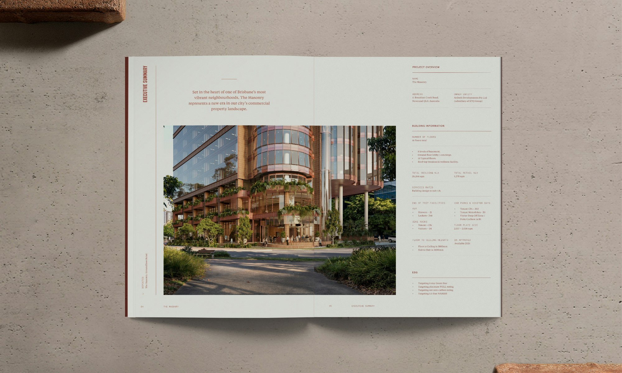
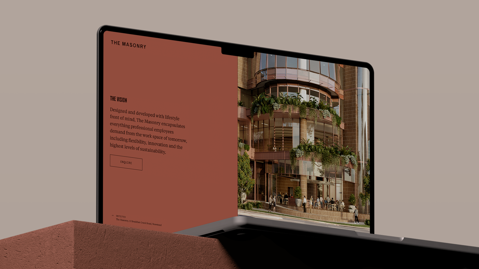
At every point, we sought to understand the project outcomes of The Masonry—aligning these with every element of our work. From concept to completion of our work, we applied a cohesive, commercially astute strategy. Our project deliverables included this holistic strategy as well as the name, visual identity, a suite of marketing collateral, copywriting and website.
