Project Overview
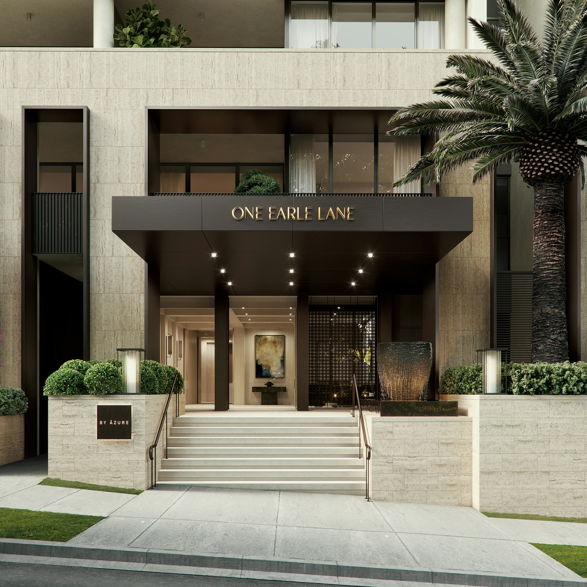
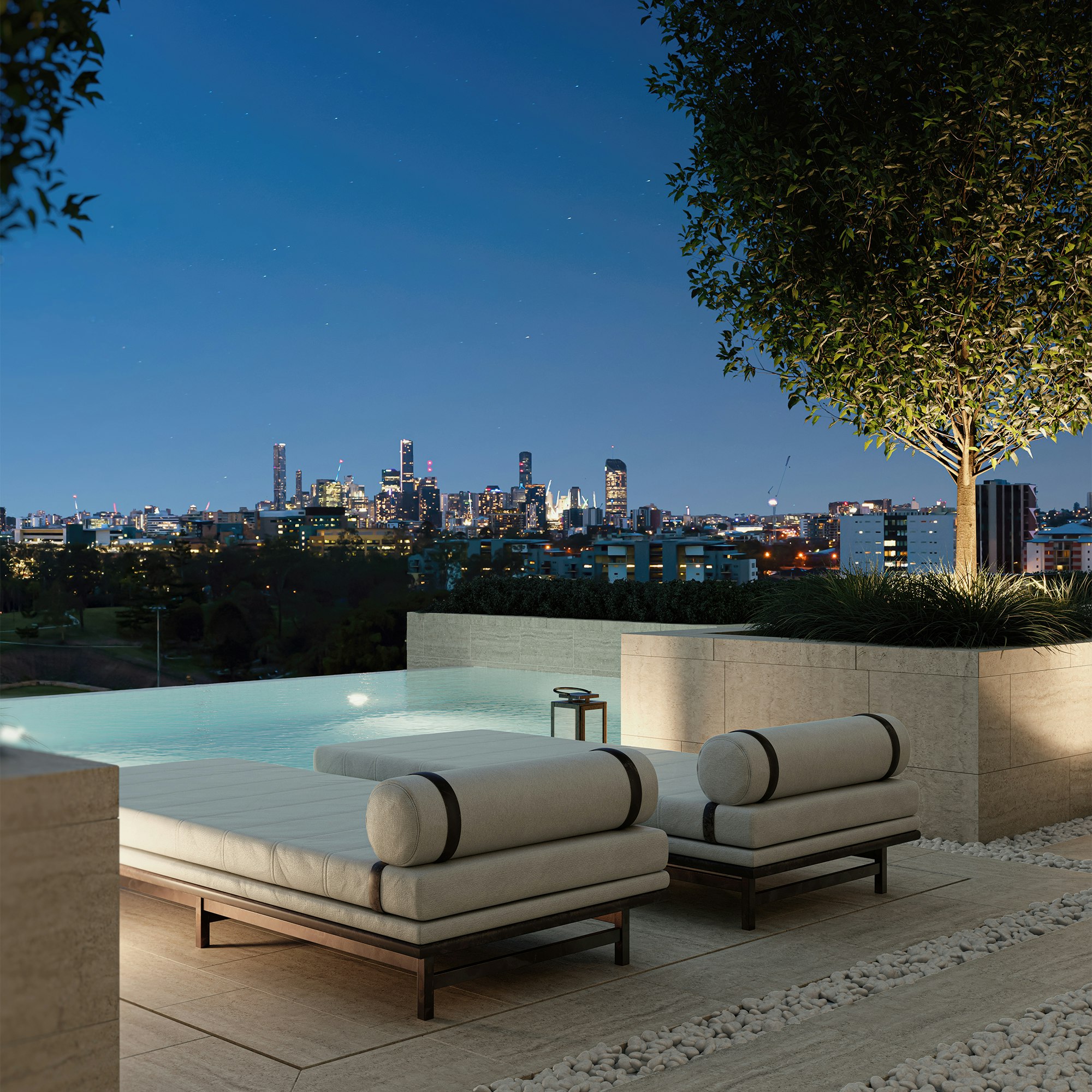
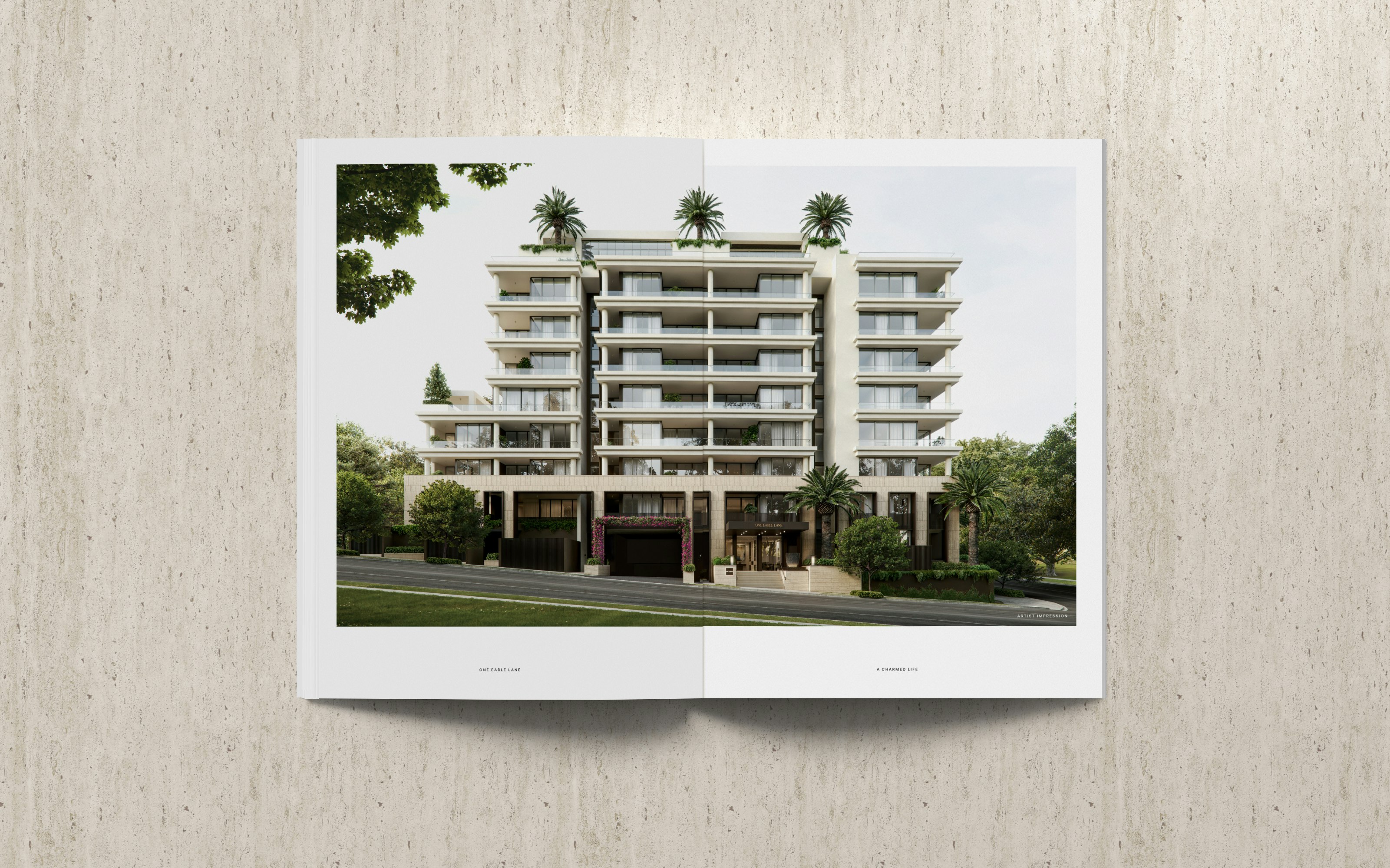
The aligning vision of One Earle Lane is intrinsically humancentric. The project itself embodies a rich design experience, crafted through light, proportion, nature, materiality and community. From strategy to design, we set out to reflect One Earle Lane’s commercial appeal through compelling and considered branding and marketing collateral.
From the start, the brand’s foundations formed from a strong sense of place. We seized the unique opportunity to own the entire lane by adopting the address as the name for the project, immediately giving One Earle Lane an inimitable and perennial project presence.
In crafting One Earle Lane’s brand, our intent was to establish an alluring concept where restraint and richness can live together. All elements of the brand unite in visual harmony. We took cues from One Earle Lane’s architecture; the way the visual continuity creates a sense of calm and used a soft, tonal palette to convey approachability and tranquillity.
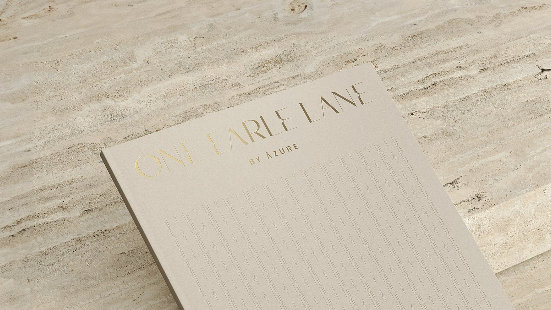
We chose a graceful display typeface designed by Miguel Reyes that defies many of the traditional classifications. Its forms are in an ambiguous space between sans and serif—both soft and sharp, modern yet with roots in the classical.
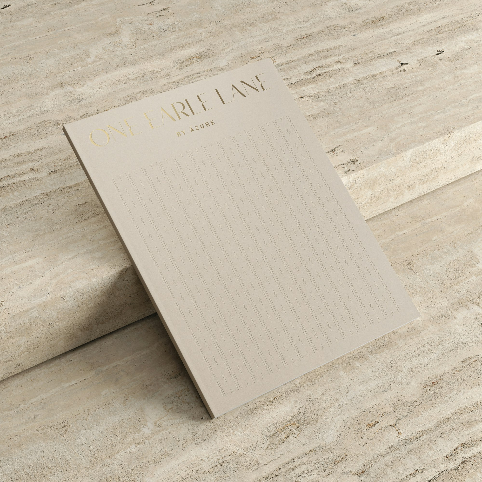
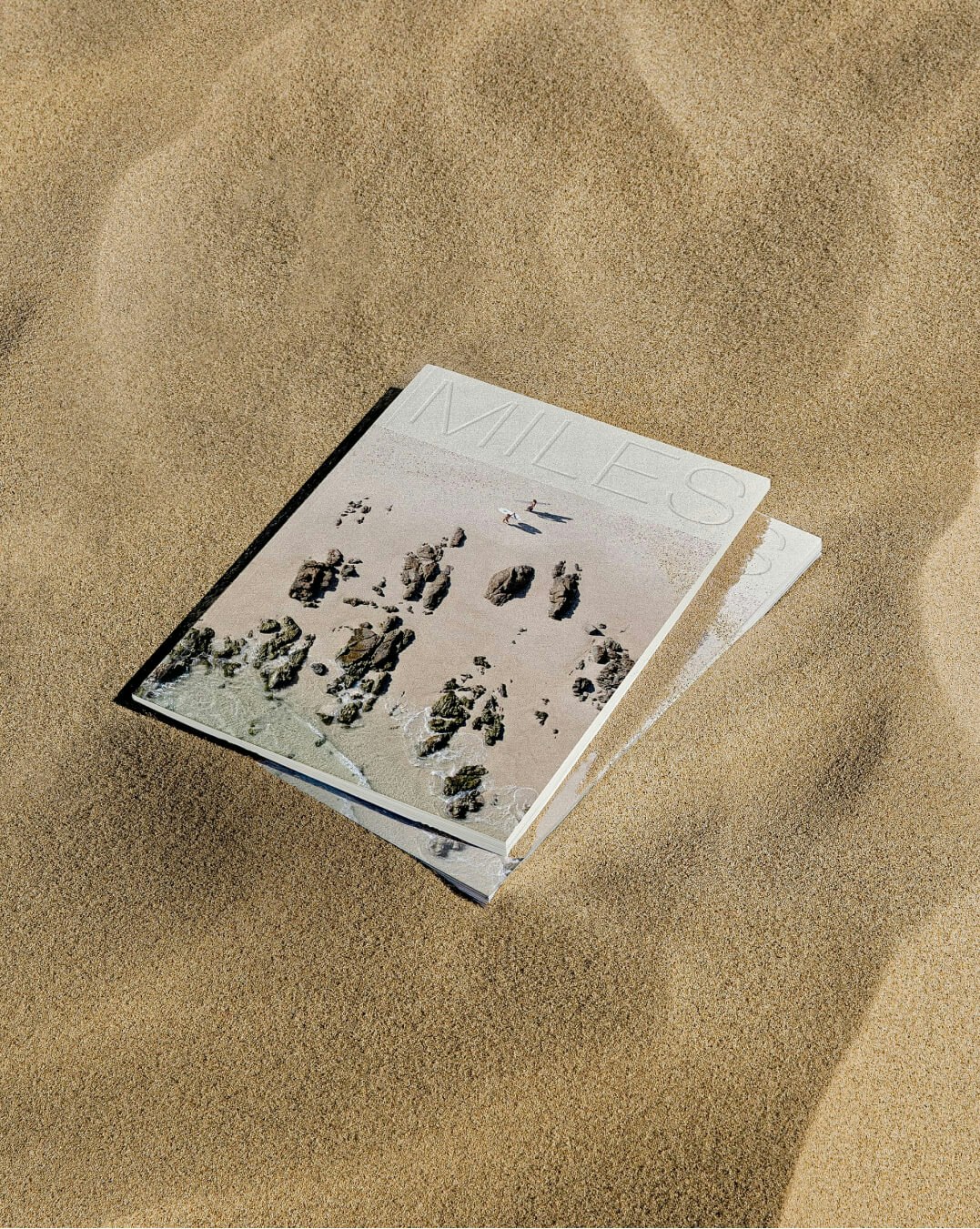
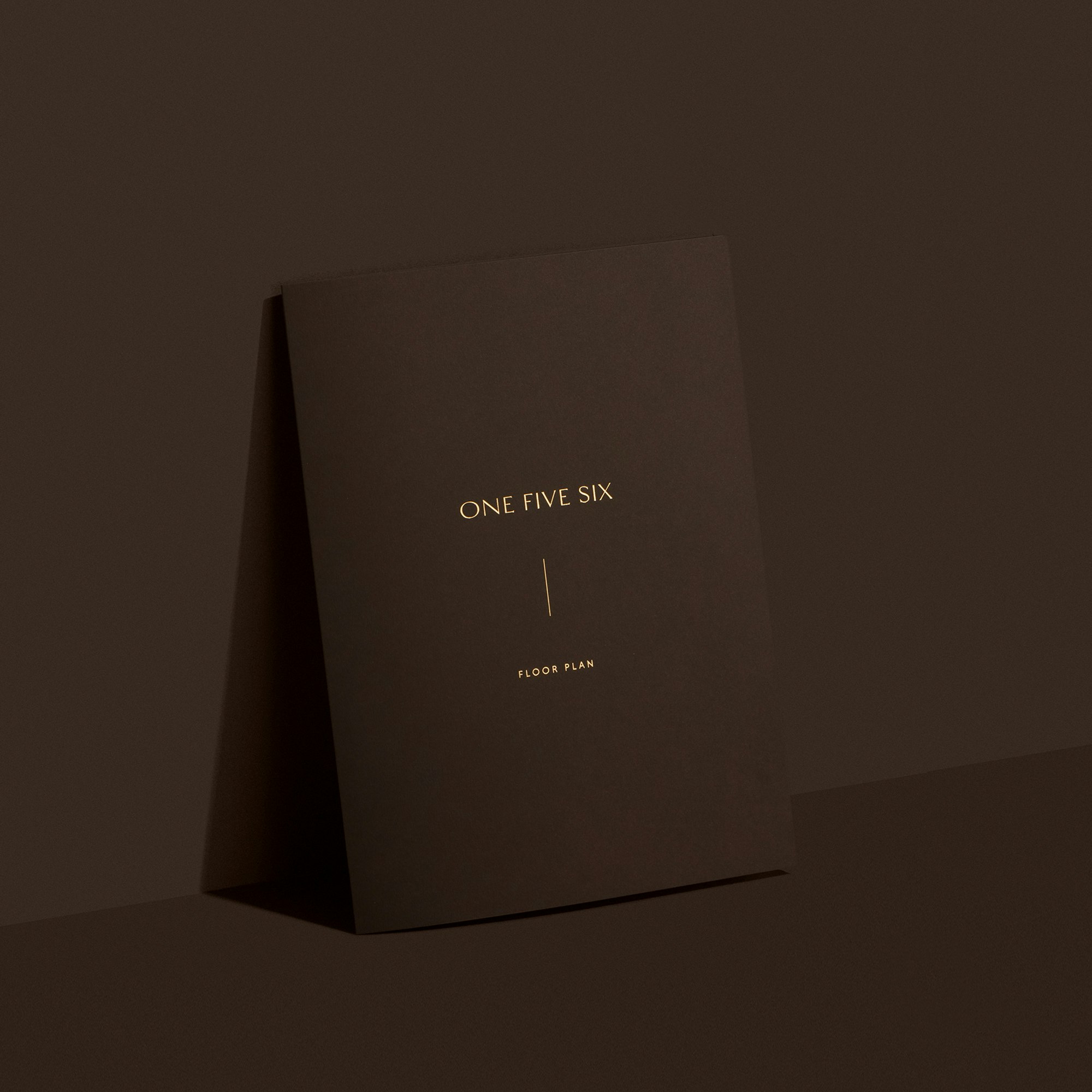
We also partnered with Artis to design a tactile and visually striking brochure. Our goal was to immerse the reader in a beautiful experience. We gave significant consideration to each placement of content within the brochure, including the custom blind-embossed rattan decoration (inspired by the Jardan interior furniture package), paired with a contrasting debossed, high-shine foil logo on a matte grey textural stock.
